AuraHealth
AuraHealth is a comprehensive healthcare app designed to help users manage their health and wellness in one place. With AuraHealth, users can track medical records, set medication reminders, access fitness and wellness tips, and stay informed on current health news. The app is aimed at individuals looking to keep up with their health, manage their daily activity, and stay engaged with relevant healthcare resources.
Background
In today’s busy world, staying on top of health can feel overwhelming. From tracking activity levels and medications to managing appointments and medical records, the sheer amount of information can leave people feeling scattered and unorganized. Without a centralized, simple way to manage it all, important tasks often slip through the cracks, making it harder to maintain a healthy lifestyle.
Role
UX/UI Designer
Duration
12 weeks
Tools
Figma, Procreate, Optimal Workshop, Lyssna
Problem statement
Health conscious users need an app that can store all their health and medical information because they are having trouble finding their medical records to stay on top of their health.
Competitive Analysis


User Research
I interviewed 3 users based on the target age range of 20-65 years old, who all have different needs/ health problems and different lifestyles. This interview was conducted over zoom. The following is a summary of the interview:
Most people receive information through social media rather than searching for it themselves. They use apps or patient portals to track their medical information, often setting alarms to remember their medication. Keeping health records organized is challenging because they're scattered across different places. Gamification features in apps fail to motivate them, and they have significant concerns about the security and privacy of their health data.
Many users struggle to stay motivated with healthy habits, though they are driven by the desire to look better and prevent future health issues. They find current health apps lacking in personalization and customization. Users prefer intuitive interfaces for manually entering health information and want notifications that can be customized to meet their specific needs.
Affinity Maps


Key Insights
User behavior and pain points:
-
Most users don't seek out information on their own but instead are fed information through various social media algorithms
-
Users use either an app or patient portal to track their medical information
-
Most users incorporate their medication schedule into their routine and use alarms if needed.
-
Users experience difficulties organizing and accessing their health records because they are not all in one place.
-
Users do not feel incentivized by the gamification feature in apps and therefore do not use it.
-
Most users are very concerned about the security and privacy of their health data.
User motivation:
-
Users are having a hard time staying motivated and consistently engaging in healthy behaviors.
-
Users are motivated to stay engaged with health and wellness related activities because they want to physically look better and also prevent future health issues
User preferences:
-
Users believe that personalized features and customization options are missing from existing health and wellness apps.
-
Users prefer to manually input their health information through intuitive and user friendly interfaces
-
Users want a way to customize their notifications to cater to their specific needs.
User Persona

Information Architecture
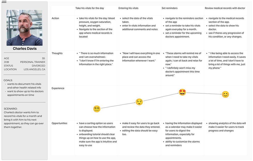
Journey Map:

User Flows
Task 1: Recording Vitals

Task 2: Setting Medication Reminders

Site Map

Version 1:
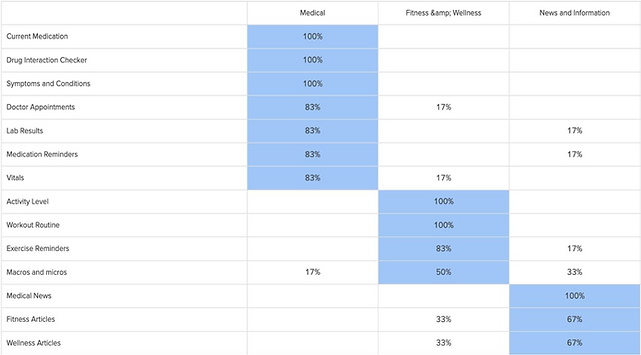
Closed Card Sorting:

After conducting the card sort, it became clear that users grouped the different features in a way that differed from the original site map. This insight prompted me to revise the site map, reorganizing the features to better align with how users naturally categorized them, improving overall navigation and usability.

Version 2:
Wireframes (From Sketches to Mid Fi)
Steps/Calories Page:


Activity page:


News Page:


Branding


I chose green as the primary color for the healthcare app because it is commonly associated with healing, balance, and calmness, all of which are essential in a healthcare context. Psychologically, green has been shown to reduce stress and promote a sense of tranquility, making it an ideal choice to help users feel at ease while managing their health. Additionally, the color is linked to nature, symbolizing growth and vitality, which aligns with the app’s goal of fostering wellness.

Hi Fi Mockups


User Testing
After developing a prototype of the healthcare app, I conducted moderated usability tests with 6 participants over Zoom. The group included colleagues, friends, and a few volunteers recruited through an online survey platform. These sessions allowed me to observe real-time interactions and gather qualitative feedback.
Main Tasks
-
Medication Reminder: Imagine you have a new medication that you need to take daily. Use Olive to set a reminder to help you remember to take this medication.
-
Track Daily Activity: You want to monitor your daily activity level. Use Olive to track today’s activity and see your progress.
-
Access Medical Records: You want to quickly review your past medical records. Find and access your records within Olive.
Key Findings
-
Issue 1: Trouble finding past medical records (High)
Description: Users had difficulty locating their past medical records. While they were eventually able to complete the task, the time to find the records was longer than expected. -
Issue 2: Unsure where the medication would be (High)
Description: Participants struggled to locate the medication feature, mistakenly thinking the button was just a header. -
Issue 3: Confused by the back button not leading them to where they want (Medium)
Description: Users were frustrated that the back button returned them to the previous screen rather than the home page. After further probing, it became clear that they expected the back button to take them to the app’s home page or the feature's main page instead. -
Issue 4: Unsure what the activity level is measuring (Low)
Description: Some users were unsure of what the activity level was tracking. They guessed it was measuring either steps or calories burned, but weren’t certain.
Iterations
Visual Design Improvements
I revamped the overall look of the app to make it more visually appealing and user-friendly. The initial design used very dark colors that failed the contrast test, making it harder to read. I updated the color scheme to feature a lighter green background with darker text, ensuring it passes the contrast test and is easier on the eyes. Additionally, I addressed spacing inconsistencies and resolved issues with the iPhone notch to create a cleaner, more polished design.


Issue 1: Trouble finding past medical records (High)
To address the difficulty in finding past medical records, I replaced the underlined year on the calendar with a search icon. The search icon is more intuitive and immediately signals its purpose, helping users locate records more efficiently.
Issue 2: Unsure where the medication would be (High)
To address confusion about the medication feature, I moved it under the calendar and changed the button into a heading. Instead of linking to a separate page, medications are now displayed directly under the heading, allowing users to view them all on the same screen for better clarity and accessibility.
Issue 3: Confused by the back button not leading them to where they want (Medium)
To address confusion with the back button, I updated it to lead users to the home page or the main page of the feature, aligning with their expectations. Additionally, I implemented saving confirmation pages and exit confirmation prompts to provide reassurance and improve navigation clarity.


Issue 4: Unsure what the activity level is measuring (Low)
To resolve confusion about what the activity level graph was measuring, I added a label above the graph that says "Total Steps." This provides clarity and ensures users immediately understand the data being displayed.
Final Design


Conclusion
One of the biggest challenges I ran into was the original color scheme. It was too dark, failed contrast checks, and made the app harder to read. I redesigned it with a lighter green background and darker text to improve accessibility and create a cleaner, more inviting look. I also fixed spacing issues and accounted for the iPhone notch to make the layout feel more polished.
Another major shift came after running a card sort. My first site map was based on how I thought users would group features, but the results showed a different pattern. I restructured the navigation based on how users actually think, which made the app easier to use and more intuitive overall.
Going forward, I’d like to keep improving the experience with more user feedback, especially around navigation and accessibility. This project was a great reminder that thoughtful design means staying flexible, listening to users, and iterating with purpose.